


The final step in an online purchase is the checkout. It’s where potential sales become real revenue. Yet, many eCommerce businesses watch shoppers fill their carts, only to abandon them at this critical stage. Frustrating, isn’t it? Optimizing your checkout process isn’t just a minor adjustment; it’s a vital strategy for boosting conversions and growing your business in 2025.
Let’s explore how you can transform those almost-sales into completed purchases, turning carts into cash.
Understanding the Checkout Conundrum: Why Shoppers Leave
Before we dive into solutions, we need to understand the problem. Cart abandonment is a major challenge for online retailers. Shoppers add items, proceed to checkout, and then vanish. Why does this happen so often?
The Scope of Abandonment: A Look at the Numbers
Industry studies paint a consistent picture: a significant number of shopping carts get left behind. According to the Baymard Institute, the average cart abandonment rate is approximately 70.19%. Think about that. For every ten shoppers who start the checkout process, seven of them walk away. That’s a substantial amount of potential revenue slipping through your fingers. This isn’t just a minor leak; it’s a floodgate. But here’s the good news: even small improvements in your checkout process can lead to substantial gains.
Common Culprits: Top Reasons for Cart Abandonment
So, what makes these shoppers change their minds at the last minute? It’s rarely a single reason. Usually, it’s a combination of factors that create friction and frustration.
- Unexpected Costs: This is a major factor. High shipping fees, taxes, or other surprise charges that appear late in the process can send shoppers away. Transparency from the start is crucial.
- Forced Account Creation: Many shoppers don’t want the hassle of creating an account, especially if they’re first-time buyers or in a hurry. Requiring it can be a significant roadblock.
- Complex or Long Checkout Process: Too many steps? Too many fields to fill out? People value their time. A clunky, confusing, or lengthy checkout is a sure way to lose them.
- Security Concerns: If your checkout page doesn’t appear secure or if you’re not clearly displaying trust signals, customers might hesitate to enter their payment information.
- Limited Payment Options: Not everyone uses the same payment methods. If a customer’s preferred option isn’t available, they might look for an alternative.
- Poor Mobile Experience: A growing number of people shop on their phones. If your checkout isn’t optimized for mobile devices, you are likely losing sales.
- Website Performance Issues: Slow loading times, errors, or crashes during checkout are incredibly frustrating and can erode trust.
- Unclear Return Policy: Shoppers want reassurance. If your return policy is hard to find or understand, it can create uncertainty.
- Distractions: Too many pop-ups, banners, or navigation options during checkout can pull shoppers away from completing their purchase.
Understanding these common pain points is the first step toward optimizing your checkout and recovering those lost sales.
Core Principles of a High-Converting Checkout
To build a checkout process that converts, you need a solid foundation. Certain principles underpin any successful checkout design. Think of these as the non-negotiables.
Simplicity is King
How many clicks does it take to buy something on your site? How many fields do customers need to fill? The simpler your checkout, the better.
- Minimize Steps: Aim for a single-page checkout if possible, or at least a clearly indicated multi-step process with minimal stages.
- Reduce Form Fields: Only ask for essential information. Do you really need their fax number? Probably not. Every extra field is another chance for them to drop off.
- Clear Visual Hierarchy: Guide the user’s eye. Make calls-to-action (CTAs) prominent and logical.
Speed and Performance Matter
Nobody likes waiting. A slow checkout process can kill conversions.
- Optimize Page Load Times: Compress images, leverage browser caching, and ensure your hosting can handle the traffic.
- Fast Transitions: Moving between checkout steps or validating information should be quick and seamless.
Build Trust and Security
Customers are handing over sensitive information. They need to feel safe.
- Display Trust Seals: SSL certificates, payment gateway logos (Visa, Mastercard, PayPal), and security badges can reassure users.
- Professional Design: A clean, modern, and error-free design inherently feels more trustworthy.
- Clear Contact Information: Make it easy for customers to reach out if they have questions or concerns.
Mobile-First Approach
With mobile commerce growing, your checkout must be flawless on smaller screens.
- Responsive Design: Ensure your checkout adapts to all screen sizes.
- Thumb-Friendly Navigation: Buttons and form fields should be easy to tap.
- Minimize Typing: Use features like address auto-fill and support for mobile payment options like Apple Pay or Google Pay.
Transparency and Clarity
No surprises. Customers should know exactly what they’re paying and what to expect.
- Upfront Cost Disclosure: Show all costs, including shipping and taxes, as early as possible.
- Clear Return and Shipping Policies: Make this information easily accessible from the checkout page.
- Progress Indicators: If you have a multi-step checkout, show users where they are in the process and how many steps remain.
Adhering to these core principles creates a smoother, more reassuring experience for your customers, making them much more likely to complete their purchase.
Pre-Checkout Optimization: Setting the Stage for Success
Optimizing the checkout experience doesn’t just start on the actual checkout page. You can lay the groundwork earlier in the customer’s journey to make the final steps smoother.
Guest Checkout: The Path of Least Resistance
Remember how forced account creation is a major turn-off? Offering a guest checkout option is one of the most effective ways to reduce friction. Many shoppers, especially first-timers, don’t want the commitment of creating an account. Forcing them to do so can lead them to abandon their cart.
- Why it works: It’s faster and requires less commitment.
- Implementation: Make “Checkout as Guest” a prominent option, just as visible as “Login” or “Create Account.”
- Post-Purchase Account Creation: You can always offer them the chance to create an account after they’ve completed their purchase, perhaps by saving their details for next time. This approach is often more successful as they’ve already committed to the purchase.
Progress Indicators: Guiding the Way
If your checkout isn’t a single page, visual progress indicators are essential. These show customers where they are in the process (e.g., Shipping > Payment > Review) and how many steps are left.
- Reduces Anxiety: Knowing what’s next and how close they are to completion can make the process feel less daunting.
- Manages Expectations: It sets a clear path, so users don’t feel like they’re stuck in an endless loop of forms.
Persistent Shopping Cart
Ever added items to a cart, left the site, and returned later to find your cart empty? It’s frustrating. A persistent shopping cart saves items even if the user leaves your site or closes their browser.
- Encourages Return Visits: If a shopper isn’t ready to buy immediately, a saved cart makes it easy for them to pick up where they left off.
- Cross-Device Consistency: Ideally, if a user is logged in, their cart should persist across devices.
By implementing these pre-checkout strategies, you’re already streamlining the path to purchase and reducing potential friction points before the user even hits the main checkout flow.
Designing the Perfect Checkout Form: Less is More
The checkout form itself is where many potential sales are lost. A poorly designed form is a conversion killer. The goal is to make it as quick, easy, and painless as possible for customers to provide the necessary information.
Minimizing Form Fields
Ask only for what you absolutely need to process the order.
- Essential Information: Name, shipping address, payment details, and email address are usually standard. You’ll also need a billing address if it differs from shipping.
- Optional Fields: Clearly mark any non-essential fields as “optional.” Better yet, remove them entirely if they don’t serve a critical purpose.
- Smart Address Handling: Ask for the shipping address first. Then, use a pre-selected checkbox like “Billing address is the same as shipping.” This saves most users from entering an address twice.
Smart Layout and Formatting
How you arrange your form fields matters.
- Single-Column Layout: For most forms, especially on mobile, a single-column layout is easier to scan and complete than multiple columns.
- Logical Flow: Group related information together.
- Clear Labels: Place labels above the form fields. This is generally more user-friendly than placeholder text that disappears when the user starts typing.
Autofill and Autocomplete to the Rescue
Leverage browser autofill capabilities and tools for address autocomplete.
- Reduces Typing: This can save users significant time and reduce errors.
- Improved Accuracy: Autocompleting addresses can prevent typos that lead to shipping problems.
Real-Time Validation and Error Handling
Don’t wait until the user submits the form to tell them there’s an error.
- Inline Validation: Validate fields as the user fills them out. Provide immediate visual feedback, like a green checkmark for success or a red highlight for an error.
- Clear Error Messages: If there’s an error, explain clearly what’s wrong and how to fix it, right next to the problematic field.
By focusing on conciseness, clarity, and user assistance, your checkout form becomes a facilitator, not an obstacle.
Secure and Diverse Payment Options: The Trust Factor
The payment stage is often where customers feel most vulnerable. They’re about to enter sensitive financial information. Building trust and offering flexibility here is paramount.
Displaying Trust Signals Prominently
Reassure customers that their information is safe.
- SSL Certificate: Ensure your entire site, especially the checkout, is HTTPS secured.
- Security Badges: Logos from security services can build confidence.
- Payment Logos: Displaying logos of accepted payment methods adds a layer of familiarity and trust.
Offering a Variety of Payment Methods
Not everyone uses the same credit card, and many prefer alternative payment options.
- Major Credit/Debit Cards: This is a baseline expectation.
- Digital Wallets: Consider options like PayPal, Apple Pay, Google Pay, and Amazon Pay. These are often faster as they use stored information.
- Buy Now, Pay Later (BNPL): Services like Klarna or Afterpay are increasingly popular, allowing customers to pay in installments.
- Local Payment Options: If you sell internationally, research and offer popular local payment methods for those regions.
Simplifying Payment Information Entry
Make it easy to enter card details.
- Card Type Detection: Automatically detect the card type as the user types the number.
- “Save Card for Future Purchases” Option: Offer this convenience, but ensure it’s opt-in and you comply with all security regulations.
Remember, the payment step is the moment of truth. Make it secure, flexible, and straightforward to maximize your chances of conversion.
Shipping and Delivery: Transparency and Choice
Shipping costs and delivery times are major considerations for online shoppers. Surprises or inflexibility in this area can lead to abandoned carts.
Upfront and Transparent Shipping Costs
Don’t wait until the final checkout step to reveal shipping fees.
- Early Disclosure: Show shipping costs on product pages or in the shopping cart. A zip code estimator in the cart is a great tool.
- No Surprises: Unexpectedly high shipping costs are a leading cause of cart abandonment.
Offering Multiple Shipping Options
Provide choices to meet different needs and budgets.
- Standard and Expedited Shipping: Offer a balance of cost-effective and faster options.
- Free Shipping Thresholds: This is a powerful motivator. For example, “Free shipping on orders over $50.”
- In-Store Pickup: If you have physical locations, offering free in-store pickup is a valuable option.
Clear Delivery Time Estimates
Customers want to know when they’ll receive their order.
- Provide Estimated Delivery Dates: Instead of just “3-5 business days,” show an actual date range if possible.
- Real-Time Updates: Once the order is shipped, provide tracking information.
Clear communication about shipping costs, options, and timelines manages customer expectations and reduces the likelihood of abandonment.
Mobile Checkout Optimization: Designing for the Small Screen
As mobile commerce continues its growth, a clunky mobile checkout is no longer excusable. Optimizing for mobile isn’t just about responsive design; it’s about rethinking the entire experience for a smaller, touch-based interface.
Simplify, Simplify, Simplify
Mobile screens have limited real estate. Every element counts.
- Minimalist Design: Remove any non-essential elements, navigation, or distractions.
- Single-Column Layouts: Almost always the best choice for mobile forms.
- Large, Tappable Buttons: Ensure CTAs and form fields are easy to tap accurately with a thumb.
Reduce Typing as Much as Possible
Typing on a mobile keyboard can be cumbersome.
- Numeric Keypads: Automatically bring up the numeric keypad for fields like phone numbers and credit card numbers.
- Address Autofill/Autocomplete: Crucial for mobile, these services can significantly speed up address entry.
- Mobile Wallets: Integrate Apple Pay, Google Pay, and PayPal One Touch. These allow users to pay with stored credentials, often bypassing most manual data entry.
Test on Real Devices
Emulators are helpful, but nothing beats testing your mobile checkout on actual smartphones and tablets with different screen sizes and operating systems.
A seamless mobile checkout experience directly translates to higher conversion rates from the ever-growing segment of mobile shoppers.
Leveraging Technology: Smart Tools for a Smarter Checkout
Manually managing every aspect of checkout optimization is a significant task. Thankfully, technology offers powerful solutions to streamline processes, personalize experiences, and recover potentially lost sales.
Tackling Cart Abandonment with Automation
Automated email and SMS reminders are incredibly effective at bringing shoppers back. When a customer leaves items in their cart, a timely, personalized message can nudge them to complete their purchase. While various email and SMS marketing platforms exist, Yotpo offers specialized solutions to address cart abandonment.
With Yotpo Email Marketing, you can:

- Set up automated email sequences that trigger when a cart is abandoned, featuring multiple, timed touchpoints.
- Personalize and segment these emails with the customer’s name, images of the items left in their cart, and direct links back to complete the purchase.
- Use marketer-focused tools like Canva integration and Conditional Content to design compelling recovery emails without needing extensive technical resources.
- Receive strategic guidance on optimizing these email flows for better deliverability and higher conversion rates.
For more immediate re-engagement, Yotpo SMS Marketing provides:

- An instant connection, leveraging the high open rates of SMS for time-sensitive cart recovery reminders.
- Automated SMS flows for abandoned carts, sending a message minutes after abandonment, followed by another if the purchase remains incomplete.
- Advanced segmentation using over 180 data points, allowing you to tailor SMS reminders based on Browse behavior, purchase history, or loyalty status.
- “Click-to-Buy” links that take shoppers directly to a pre-populated cart, creating a seamless checkout experience.
- Multi-channel coordination to align SMS and Email efforts for a more cohesive cart recovery strategy.
These Yotpo tools are designed to work powerfully on their own to combat cart abandonment. However, their effectiveness can be amplified when used as part of the comprehensive Yotpo Retention Marketing platform. Insights from other Yotpo products can inform the personalization of these abandonment messages, creating an even more compelling reason for shoppers to complete their purchase.

Building Trust with Reviews and User-Generated Content (UGC)
Social proof is incredibly powerful, especially at the checkout stage. Seeing positive reviews and real customer photos can alleviate doubts and encourage conversion. Yotpo Reviews helps brands collect and strategically display high-impact reviews to build trust throughout the buyer journey.
- Yotpo provides customizable strategic display widgets to showcase reviews, star ratings, and customer photos directly on product pages and near checkout buttons.
- Q&A functionality allows potential customers to get answers from past buyers, reducing uncertainty before they even reach checkout.
- Collecting and displaying visual UGC (customer photos and videos) provides authentic social proof, helping shoppers visualize ownership and trust product quality.
- Yotpo’s Reviews Atlas offers deeper insights from review content, helping businesses understand customer sentiment and product performance.

Using Yotpo Reviews as a standalone solution can significantly enhance trust and conversion. When integrated within the broader Yotpo platform, review data can fuel personalization in Email and SMS campaigns or integrate with loyalty programs, creating a ripple effect across all your retention efforts.
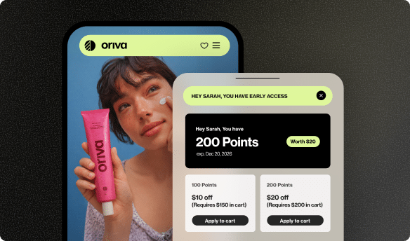
Sweetening the Deal with Loyalty Programs
Integrating loyalty program benefits directly into the checkout process can be a powerful incentive. Yotpo Loyalty allows brands to create customized loyalty and referral programs that encourage purchase completion and repeat business.
- Clearly displaying how many points a customer will earn from their current cart can motivate the purchase.
- Allowing customers to easily redeem points at checkout for a discount is a highly effective way to drive conversions.
- A VIP tier benefits reminder (“You’re only $X away from Gold Tier benefits!”) can encourage customers to complete the purchase or even add more to their cart.
- Yotpo Loyalty emphasizes flexibility and customization, helping brands create unique loyalty experiences tailored to their customers, with robust reporting to track effectiveness.

Yotpo Loyalty is designed to be a powerful standalone solution for building customer retention. As part of the integrated Yotpo platform, loyalty data can seamlessly enhance other channels, like segmenting Email and SMS campaigns based on loyalty tiers, creating a cohesive experience where loyalty is consistently rewarded.
A/B Testing: The Path to Continuous Improvement
You’ve implemented best practices and streamlined your forms. But how do you know what’s truly working best for your audience? The answer is A/B testing. This involves creating two versions of a webpage element and showing each to a different segment of your audience to see which performs better.
What to Test in Your Checkout
The checkout process has many elements ripe for testing:
- Call-to-Action (CTA) Buttons: Test text, color, size, and placement.
- Form Layout: Compare a single-page versus a multi-step checkout.
- Trust Seals: Test which seals to display and where to place them.
- Guest Checkout Prominence: Experiment with how the guest checkout option is presented.
- Payment and Shipping Options: Test the order and presentation of different choices.
How to Conduct Effective A/B Tests
- Identify a Goal: What do you want to improve?
- Formulate a Hypothesis: What change do you believe will lead to an improvement?
- Create Variations: Change only ONE element at a time for accurate results.
- Split Your Traffic: Evenly and randomly divide your traffic between the two versions.
- Run the Test: Allow enough time to gather statistically significant data.
- Analyze and Repeat: Implement winning variations and continue testing.
Continuous testing and iteration, guided by data, are key to unlocking your checkout’s full conversion potential.
Future Gazing: What’s Next in Checkout Optimization?
The world of eCommerce is always evolving, and checkout experiences are no exception.
- Hyper-Personalization with AI: Artificial intelligence will play a larger role in tailoring checkout flows, personalizing payment options, and preventing fraud without adding friction.
- Voice Commerce (vCommerce) Checkouts: As smart speakers become more common, voice-activated checkouts will become more prevalent, though security remains a key challenge.
- One-Click Checkouts Everywhere: The convenience of one-click purchasing will continue to expand, likely with more standardized solutions across different platforms.
- Sustainability and Ethical Choices at Checkout: Consumers are increasingly conscious of their environmental impact. Offering carbon-neutral shipping or donation options can build brand affinity.
The core principles of speed, simplicity, and security will always remain, but the technology used to achieve them will continue to advance.
Conclusion: Your Checkout is a Conversion Engine
An optimized eCommerce checkout is a powerful conversion engine, not just a transaction point. Understanding cart abandonment, applying optimization principles, and leveraging technology are crucial. Focus on simplicity, speed, security, guest checkouts, transparent pricing, and mobile optimization.
Tools like Yotpo’s Email, SMS, Reviews, and Loyalty solutions can recover abandoned carts, build trust, and incentivize purchases. Continuously test and adapt to achieve a smooth, efficient checkout experience, consistently turning browsers into buyers and driving significant business growth in 2025.
FAQs
What is the single most important thing I can do to optimize my checkout today?
If you have to pick just one, offering a guest checkout option often provides the quickest significant lift. Many shoppers abandon carts because they don’t want the hassle of creating an account. Removing this barrier can immediately reduce friction.
How many steps should my checkout process ideally have?
Fewer is generally better. A single-page checkout is often ideal if designed well. If you must use a multi-step process, aim for no more than 3-4 clearly indicated steps and always use progress indicators.
How can I make my checkout feel more secure to customers?
Prominently display trust signals. This includes ensuring your site uses HTTPS (with a visible padlock icon), showcasing security badges, and displaying logos of well-known payment providers. A clean, professional design also contributes to a sense of security.
Why is mobile checkout optimization so critical?
A large and growing percentage of online shopping happens on mobile devices. If your checkout process is difficult to navigate on a small screen, you’re likely losing a significant portion of potential sales. Mobile optimization ensures you cater to how a large segment of your audience prefers to shop.
How can Yotpo specifically help with cart abandonment related to checkout?
Yotpo addresses cart abandonment primarily through Yotpo Email Marketing and Yotpo SMS Marketing. These tools allow you to send automated, personalized reminders to shoppers who leave items in their cart. Yotpo Email can use targeted flows, while Yotpo SMS offers immediate impact with high open rates and Click-to-Buy links that take shoppers directly back to their pre-filled carts. Additionally, Yotpo Reviews displayed at or before checkout can build trust and reduce doubt, while Yotpo Loyalty can offer incentives to encourage completion.


 Join a free demo, personalized to fit your needs