Elaborate window displays, mannequin arrangements, and decoratively folded sweaters are all part of a store’s strategy to create just the right environment for shoppers.
Running a store online doesn’t limit your ability to create an ambiance for your customers – rather, it gives you a whole new set of tools for attracting new customers’ interests and setting the stage for your products.
If you’re looking for a way to create a memorable online shopping experience for your customers, look no further than online visual merchandising.
What is Online Visual Merchandising?
While online merchandising is the strategic display and arrangement of products in your eCommerce store, online visual merchandising is the act of using the visual elements to really enhance the overall experience.
This starts with smart branding and professional product photos, but it expands to more advanced visual marketing concepts like the right placement of customer photos and star ratings to increase trust.
Because we’re talking about visual merchandising, it’s better to show than to tell.
In this guide we’ll start with a few examples of amazing visual merchandising, explaining what they did right and how you can do the same, before going into specific visual strategies and tactics of website merchandising.
Examples of Effective Merchandising Online:
Rhone
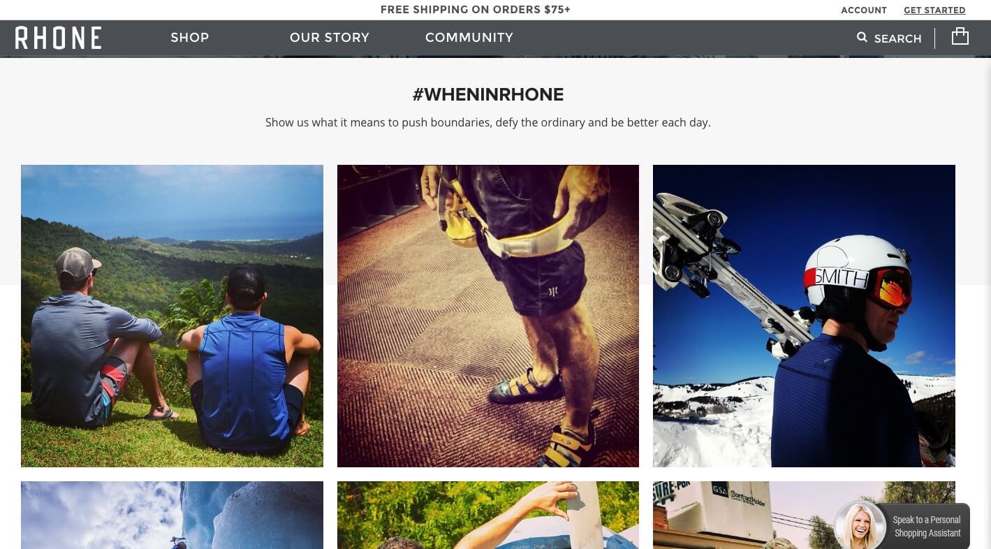
What they did right:
- Fabulous gallery featuring customer photos from their ongoing user-generated content campaign #wheninrhone on Instagram, which encourages customer engagement and cultivates top notch UGC showing off Rhone products in the wild!
- Enhanced browsing, allowing customers to sort products by size, price, fit, and even what kind of technology a product features.
- Detailed, high quality product photos showing a variety of angles down to details in stitching and hems, leaving no room for consumer anxiety – everything is clear.
Pura Vida
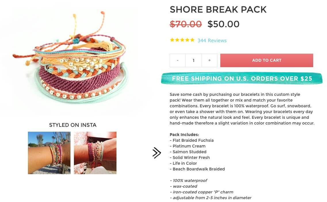
What they did right:
- Clean, colorful design that adapts for a frictionless mobile online shopping experience
- Seamless integration of customer Instagram photos, showing how the product looks in real life, on real people
- Detailed product descriptions that help customers picture how they might wear the bracelets (surfing! snowboarding!)
The Most Important Aspects of Online Merchandising
Now that we’ve reviewed what great web merchandising looks like, let’s figure out what made these stores so successful.
Visual merchandising is a multi-faceted field with a number of techniques working in tandem to elevate the overall online shopping experience.
Here are a few of the most vital aspects:
Product photos
Product photos are your number one sales tool in eCommerce.
Photos are the best way to answer customer questions about the details and features of an item.
Before, all stores needed to do was make sure they had excellent professional photos that displayed their products accurately and in full detail.
But today, customers don’t trust branded product photos anymore. Rather, they’d prefer to see customer photos of a product.
Displaying customer photos on a product page is a powerful way to improve customer trust.
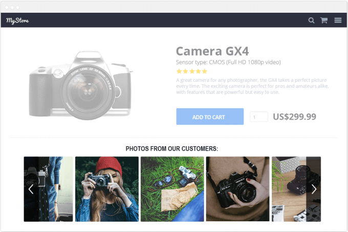
Just look at the stats: when one store added customer photos to their product pages, checkout increased by 24%!
So, in order to have product photos that really improve your website merchandising, at least some (if not all!) of your product photos should be user-generated content.
Genuine Customer Experiences
Consumer trust is best earned by showing off the real-life experiences of other satisfied customers.
User-generated content (UGC), like customer reviews, photos, and videos, is the most authentic and aesthetic way to tell customers’ stories straight to prospective buyers.
Brands are getting more creating in how they integrate this into their merchandising – rather than just displaying customer photos and reviews on product pages, they’re also adding them to photo displays and email marketing.
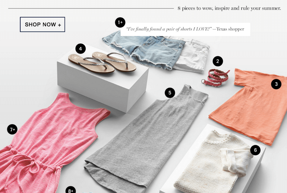
Look at how Gap uses customer reviews – each time you hover over an item in this photo, a review (rather than product information) displays:
Aesthetic Design
The design of your site is how you catch customers’ attention, draw them in, and make them feel comfortable and confident buying from you.
It’s a major component in influencing consumer behavior and should not be taken lightly.
Your store’s look and feel should be professional, inviting and suitable for your industry and target market.
Mobile responsiveness
Since huge numbers of customers shop exclusively on their phones and tablets, your eCommerce merchandising must be mobile responsive.
All of your products and features should be mirrored on your mobile site, including images, product descriptions, and reviews.
But to take this a step further, you also need to create marketing for multiple devices and not just adapt your current marketing and merchandising to mobile, but be strategic in developing a mobile-specific experience.
- Amazing product photos
- Positive customer experience
- User-generated content
- Mobile responsiveness
5 Tips for Stellar Website Merchandising
Bring your online store to the next level with these eCommerce merchandising best practices:
1) Focus on telling a story
Your online visual merchandising plan should focus on telling your brand’s story and creating a window-shopping, browsing experience that fosters impulse buys and multiple product purchases by enticing customers beyond what initially drew them to your site.
Look at how Rhone displays customer photos next to a quote and brand story that ties visual elements to their text-based story:
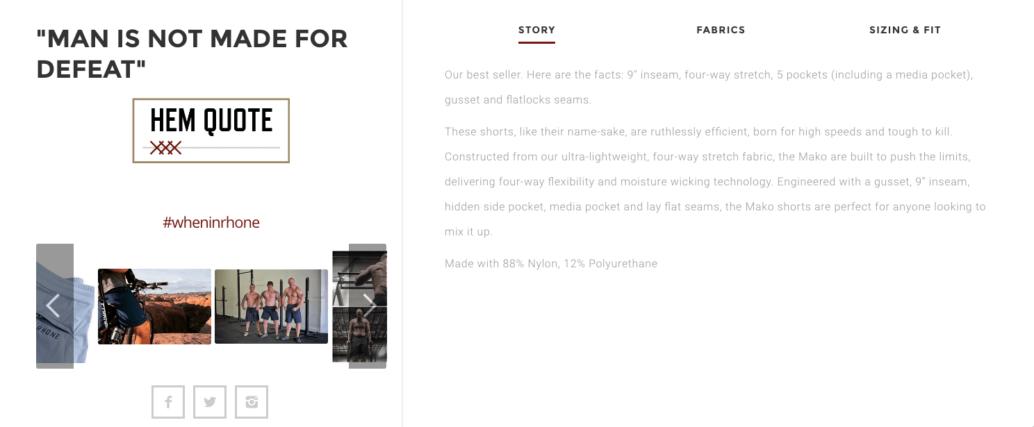
This is a perfect example of how visual and non-visual elements of web merchandising can work together to tell a seamless and cohesive story.
2) Highlight user-generated content
One of the best ways to tell your brand’s story is through user-generated content. The value of UGC is that it taps into a phenomenon called social proof, which describes the way humans respond positively to what others enjoy, and avoid what others dislike.
For example, by channeling content from your customers’ user generated content on Instagram, you can highlight photos that are already generating social buzz.
What’s more, there are plenty of tools out there to help you, like Yotpo’s new visual marketing solution that allows you to easily curate and place customers’ Instagram pics on your product pages and create an Instagram online shop.
Featuring UGC has the added benefit of building up the customer loyalty, showing them that you noticed their enthusiasm and are making them the stars of your site.
3) Offer a customized shopping environment
One advantage that website merchandising has over physical stores is the ability to tailor the shopping experience to each customer.
By prompting your customers to provide shopping preferences, (“What kind of event are you shopping for?” “What kind of dog will these treats be for?”) you create a customized shopping experience that shows them the most relevant products and therefore increases the likelihood of conversion.
You can also mine for invaluable customer data that will allow you to improve and elevate your website merchandising even more.
If you’re smart, you’ve got every bit of your site compiling data about your customers purchasing trends and patterns.
Don’t let this data go to waste!
Funnel it into creating a superior visual commerce experience for your customers through your eCommerce merchandising strategy.
4) Dazzle with your product description
Product descriptions should achieve two things.
They should give your customers every detail they need to confidently click “buy now,” and paint a picture of how the customer could use and benefit from the product.
This means that size, shape, features and other details should be clearly outlined in one section, and then you should suggest ways and situations in which your customers could use your product, letting them picture it in their own lives.
Another way to visually power product descriptions is by placing them next to customer photos, as we saw in the Rhone example above.
Conversely, maybe the product description will help a customer realize this isn’t the product they’re looking for, and guide them to a similar product that’s a better fit in your store.
5) Enable browsing enhancements and optimize your search feature
Another advantage eCommerce merchandising has over physical stores is the additional sorting power shoppers have on the web.
Enabling browsing enhancements such as sorting products by color or specific features allows customers to find products they may not have otherwise seen if they could only sort for a particular item category.
ASOS, which carries over 750 brands and has a huge inventory, shows how to offer plenty of sorting options while still retaining a minimal and easy-to-scan look:
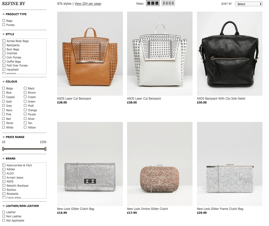
And in addition to sorting options, many customers begin their shopping by typing into your site’s search bar, so it’s vital to keep your product pages complete and up-to-date with relevant key-words and features.
So, what are you waiting for? Get out there and give your site that “wow” factor with a visual merchandising spruce!
Recap
Bringing your online visual merchandising to the next level is not difficult, it just takes strategy.
Remember these 5 top visual merchandising tips:
- Photos must be high quality, provide detail, and show your product in action
- Encourage and incorporate UGC as much as possible – let your customers do the selling, since they are the ones doing the buying.
- Optimize browsing by providing many categories and keeping your products searchable.
- Make sure all of your pages and products are mobile responsive for shopping on-the-go.
- Everything on your site, from product descriptions to customer photos, should tell the story of your brand so that your customers want to be part of that story – hopefully by making a purchase and sending in a photo of them enjoying your product!


