Even eCommerce stores need to make changes to improve their store from time to time.
Renovating your online store improves your customer experience, which makes purchasing easier, and in turn, increases your sales.
When it comes to optimizing your eCommerce store’s shopping experience, there’s no single fix. Rather, it’s the result of many tiny changes that add up over time.
According to the customer experience pyramid, there are multiple levels of how a customer interacts with a brand.
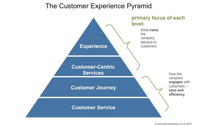
As you can see, many aspects add up to create the total customer experience.
Instead of focusing on the customer journey or customer service, let’s focus on everything you can do on your site to make your online shoppers’ immediate impression of your brand as positive as possible.
From refining your site search to accurately representing your products, you can make a better eCommerce site with simple optimization fixes that will make a huge difference.
1. Increase your site’s load speed
Your online customers’ experience of your site starts before it even loads on the screen. And the longer it takes to load, the less likely people are to stick around.
Faster websites create a higher-end online shopping experience. They can rank higher in search results and, most importantly, they tell your online shoppers that you take their limited time seriously.
A fast, responsive site is a crucial part of creating a positive customer experience and building brand loyalty.
You have a few options for improving load speed. You could benefit from high-performance web hosting, ideally tailored to your site and the varied amounts of traffic you expect year round.
You should also consider managed hosting, which leaves the technical side of powering your website to your hosting provider’s own team.
It’s also well worth considering a content delivery network, which can speed up your site significantly for visitors both in your own country and overseas.
- Quick site speed can boost SEO
- Fast site speed makes for a better customer experience
- You can improve your site speed with managed hosting or a content delivery network
2. Design for your audience — and multiple screens
Your idea of a great online store may not necessarily match your customer’s expectations, and this can be a serious obstacle when optimizing your site for increased sales.
Taking the time to understand your customers’ expectations when shopping online, and how they see your brand, is one of the crucial elements of optimizing your store’s shopping experience.
Aim to refine your site’s look and feel with a particular focus on style, simplicity, larger imagery, and more concise text.
A well-designed online store isn’t afraid to hold back content below the fold — to use blank space or large images and to let the customer scroll to learn more. However, make sure that the information you’re driving potential customers to scroll down to is worth it and that it further builds on the online shopping experience.
In essence, avoid information overload.
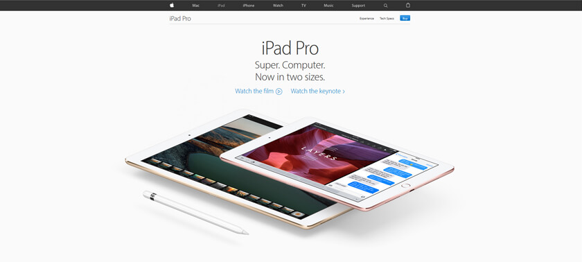
Apple’s website is a prime example of understated design, which demonstrates a clear understanding of the people who buy Apple products — nor is it afraid to make its visitors scroll:
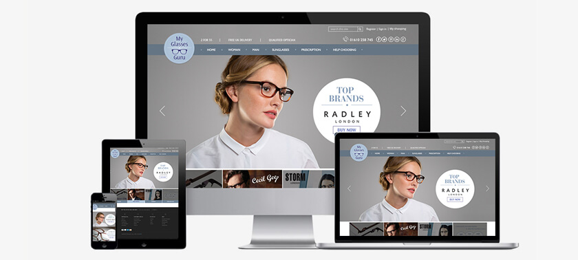
It’s also important to pay attention to how this experience comes across on difference screens. Your design should be mobile responsive and look awesome on every device.
- Improve your site design by focusing on simplicity
- Large images and text help
- Don’t be afraid to include things below the fold
3. Refine your site’s navigation
The simpler your site is, the better. With less navigation and interactions required of your visitors, you’ll create a more seamless shopping experience.
If your site uses loading bars or motion effects as part of its entry or navigation, you could also think about removing these for the sake of slightly faster access to your site’s information, products, and services.
A high-speed experience of your site is often preferable to a more interactive one, which can take up vital time (especially for mobile users).
Review your site navigation and aim to display your full market offering as clearly as possible — striking a balance between showing your full range of products/services and making them easy to find.
Larger drop-down navigation boxes, like those used on T.H. Baker’s website, are an effective way to present both a stripped-back first impression of your homepage, and comprehensive product listings if you stock a large number of products or brands:

- When it comes to navigation, find a balance between showing all of your products and making them easy to find
- Larger drop-down navigation boxes can be effective in showing many products
- Loading bars and motion effects can slow your site and should be removed if possible
4. Focus on informative, visual content
Your advertising, social media activity, and branded communications serve to pitch your prospective customers on your products and services, so you don’t need to continue the promotional content once visitors arrive at your website.
Instead, your site should provide valuable, accurate information concisely, which will dispel your customers’ doubts and objections and encourage them toward making a purchase.
Focus on visual eCommerce content, with less written content. Including super high-quality images, 360° rotating images, or video explainers are a powerful way to really show what you have to offer.
Your on-site visuals should also emphasize the lifestyle connected to your brand.
A great way to get lots of visual content is by asking your customers to contribute pictures showing how they use your product.
User-generated photos are one of the most powerful ways to instill trust in potential buyers.
Also bear in mind that many products, brands, services, and locations can sell themselves purely on the strength of their visual appeal.
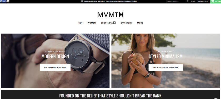
So, it’s well worth sacrificing more prime real estate on your website to feature large images of products and aspirational lifestyles:
- Your on-site content should be informative, not promotional
- Focus on improving your online visual merchandising — more visuals, less text
- 360 degree images and videos can help better illustrate your product
- User-generated content, like photos, can be highly effective in showing your customers what to expect
5. Remove checkout obstacles & simplify the buying process
Online stores can hold themselves back by presenting unwelcome obstacles to visitors before they can complete (or sometimes even begin) their transaction.
For example, disruptive pop-ups to sign up for newsletters, additional cross-sell marketing creeping in, or even a wall that requires visitors to register before they continue can all stop the customer journey in its tracks and drive people away from your site.
Instead, opt for unobtrusive alternatives like a newsletter signup on your blog instead of in a pop-up, or subtle cross-selling advertisements.
Your goal is to get people to the buying finish line, which is why in addition to doing away with obstacles, you also need to make it as easy as possible for customers to buy.
Some ways to simplify the buying process:
- Add a predictive product search function
- Streamline your checkout to a single page and strip back forms, reducing work on your customers’ part
- Add a more sophisticated address field which only requires a street name or zip code to complete itself automatically
- Present multiple trusted payment gateways at the point of payment
- Introduce a buying guide to help shoppers find their desired product faster
6. Build customer trust to encourage purchases
What your customers say about you in reviews, via a trusted reviews hub, can be much more powerful than anything you could say about yourself.
The great strength of featuring customer reviews and testimonials on your site is their ability to dispel your customers’ doubt and uncertainty, which can stop them from buying your products or services.
It’s also beneficial to use a select few high-quality trust markers on your site, such as:
- Badges from trusted reviews sites
- Google’s Certified Shop badge
- A trusted SSL certificate to keep your customers’ data safe
- Any seals, memberships, or brand logos that indicate that you’re a certified retailer of your products and services
Conclusion
In summary, one of the greatest obstacles to achieving a great online shopping experience is, essentially, an outdated website.
Businesses can underestimate just how quickly customer expectations are shifting with advances online — and if customers’ first impressions of an online store is of a slow, complex, older-looking website that isn’t optimized for mobile, then they’re highly likely to quickly click away and buy from the competition instead.
Keeping an online store up to date doesn’t necessarily need to happen in periodic, time-consuming overhauls.
It’s often better to treat the business of updating an online store like an ongoing insurance policy against falling behind the competition; a policy designed for continued growth in your site’s traffic and to increase the eCommerce conversion rate.
Online trends are changing constantly, so you may consider investing in several hours of expert site development time each month.
This approach can keep your online store constantly up to date, ensuring that it’s always fresh, appealing, delivering on your customers’ changing expectations, and increasing your sales to grow your business.






 Join a free demo, personalized to fit your needs