It’s go time! The world has suddenly become “subscribable” and brands are snatching tickets and getting on board. Let’s talk about staying ahead of the curve with three places you can start optimizing today to start seeing results tomorrow!
We’re talking about your subscription widget, the first place your customers are interacting with your subscription offering. In addition, we’ll give you some best practices for setting up an engaging customer portal. And finally, we’ll show you how to keep customers coming back again with clear and engaging emails.
Buckle up!
1.) Optimize your product widget to maximize subscriber conversion
The onsite widget serves as the initial point of contact for most shoppers, playing a crucial role in influencing their purchasing decision and determining whether they choose to subscribe. To maximize subscription conversions, consider implementing the following tactics for displaying your onsite widget effectively.
Enhance your PDP layout with expandable radio buttons
Boost conversions with this intuitive layout option, optimizing PDP space for maximum results. The main guideline for radio button design is to select one of the radio buttons by default, this allows the merchant to make a suggestion for the shopper.
In the case of a subscription, the merchant may select the option with the highest order frequency and best discount for the customer.
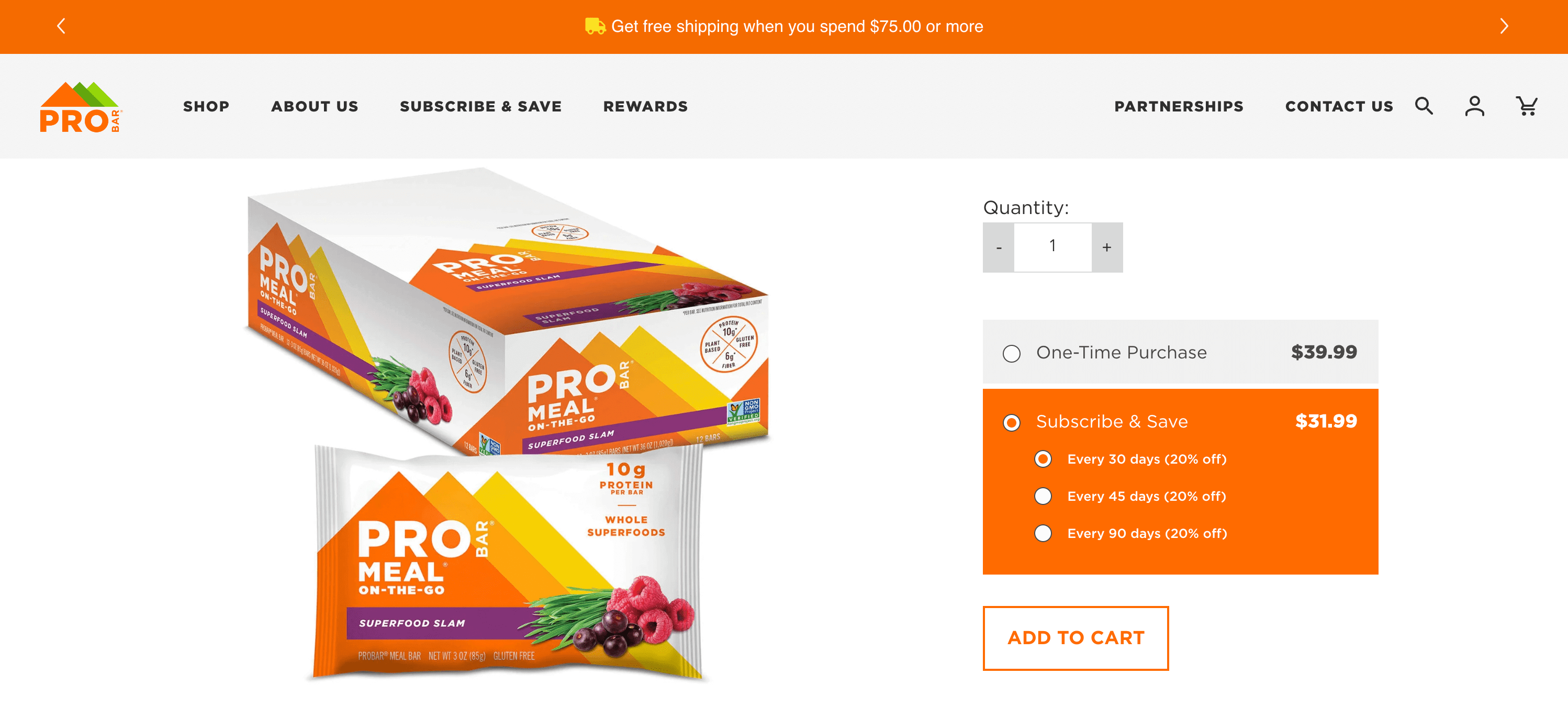
Default the purchase selection to automatically subscribe shoppers
While this may not be a fit for every brand, when you default the purchase selection to subscribe and save, you can optimize for shopper convenience and maximize engagement. But before you set it and forget it here are a couple of tips for using this optimization strategy.
- Make it very clear that subscribe and save has been selected
- Use bold colors to differentiate between your one-time selection and your subscription
- Don’t mince words, clearly, state shoppers have selected a recurring order option
The good news is, Amazon has done a lot of the leg work here for brands wanting to use this option. Many of Amazon’s products that are offered on subscription default to the subscription selection. That means customers are conditioned to look out for this and won’t likely be caught off guard or subscribe by mistake.
Display subscription benefits
Sometimes, when we’re setting up our subscription offerings, we think that a discount alone will drive conversions. However, due to the recurring nature of subscriptions, it’s important to reiterate the benefits a customer is receiving by subscribing.
This is where displaying subscription benefits comes into play. Drive higher conversions when you show subscription benefits on the onsite widget, enticing customers with discounts and shipping perks, and motivating them to subscribe.
In addition to the three widget recommendations above we also suggest customizing the entire look and feel of your PDP. Make a lasting impression by selecting your brand’s fonts and colors, ensuring a cohesive and immersive brand experience for your customers.
And if you’re looking for even more customization, we made it easy for you to level up with our CSS editor. Our CSS editor empowers brands to create a unique and tailored onsite experience that reflects their distinct style and identity.
2.) Boost subscriber retention with an optimized customer portal
Personalizing the customer portal to align with your brand and optimizing it for transparency, intuitive design, and customer flexibility is crucial. It not only decreases the reliance on support team resources by empowering customers to manage their subscriptions independently, but also prevents churn, mitigates negative brand sentiment, and ultimately boosts subscriber retention.
To maximize subscription retention, consider implementing the following tactics when designing your portal.
Optimize for mobile first
80% of subscribers access their customer portal through mobile. You need to make sure that your design is fully optimized for mobile. Use the mobile preview to ensure that the look & feel, the text, and the images look good.
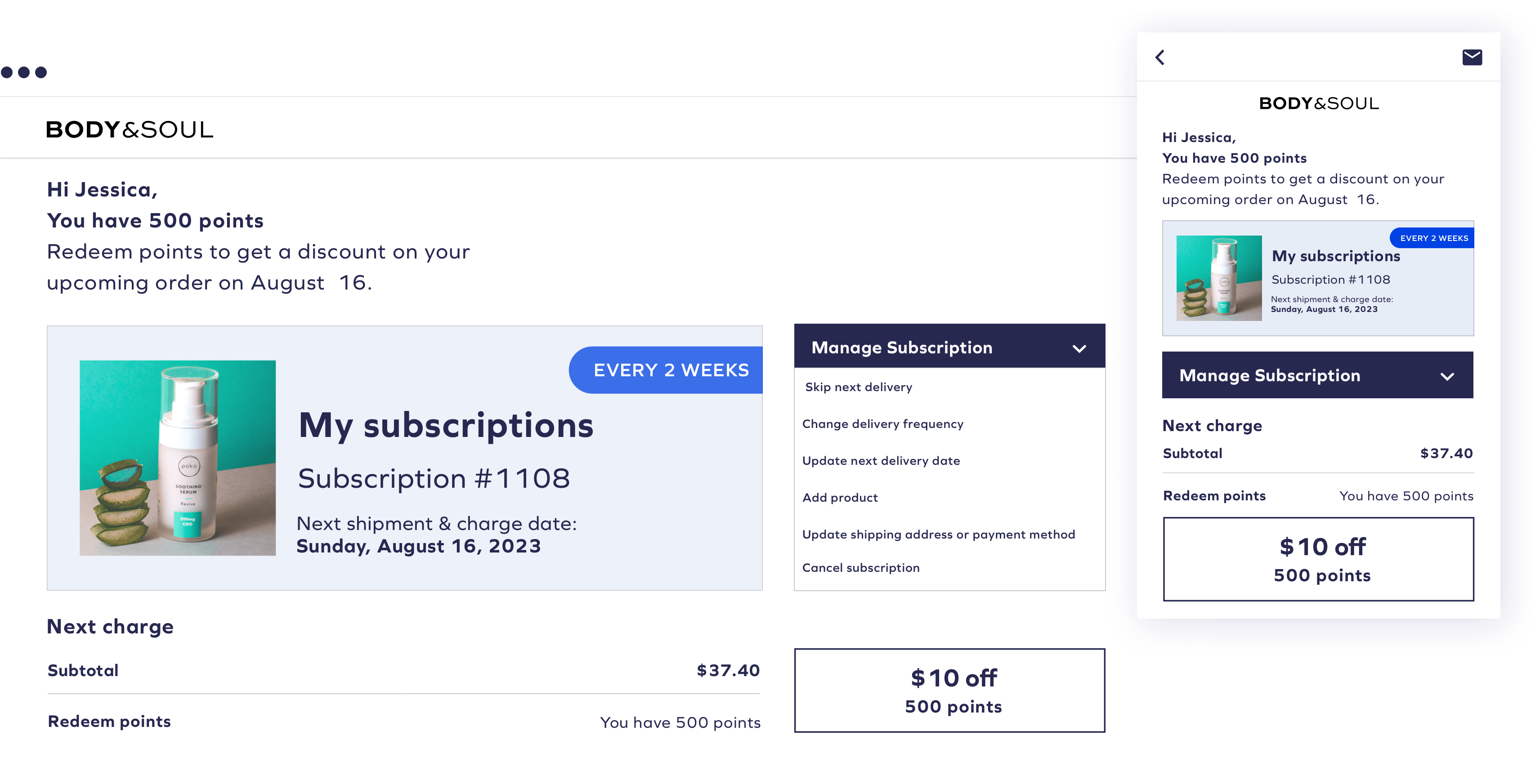
Create a flexible shopper experience
Providing subscribers with comprehensive actions within the customer portal is crucial. Contrary to the misconception that limiting available actions improves retention, the reality is that the more actions customers can take from the portal, the fewer support team resources are needed, negative sentiment is minimized, and churn rates are reduced.
Here are a couple of ways you can give your customers more flexibility
- Allow shoppers to skip a delivery or push it back
- Easily allow them to update their shipping address
- Give them the option to add more items to their recurring order to save on shipping costs
- Offer the option of pausing their subscription in lieu of canceling
We recommend activating as many available actions as possible to give subscribers a sense of total autonomy over their experience. And, in addition to optimizing your product widget and your customer portal, don’t be afraid to try new things.
“Test specific subscription offerings to gain valuable insights into customers’ preferences and determine which options resonate most effectively. This approach not only helps businesses better understand their customers but also allows them to identify subscription models that have a positive impact on the brand’s overall profit margin.”
Drew Himel, CEO, Fireside
3.) Optimize your subscription emails and focus on the connection over transactions
Put a little more effort into your transactional emails and optimize them for customer connection. Doing so can elevate the way you communicate with your shoppers. This approach turns boring emails into powerful communication tools that enhance subscriber engagement, reinforce your brand identity, and deliver a superior user experience.
To maximize engagement here are three key areas of focus when crafting your transactional subscription emails.
Brand design
Transforming transactional emails into valuable touchpoints with your subscribers is crucial, and having a branded design plays a vital role. It reinforces your brand identity and turns necessary communications into meaningful interactions, fostering trust, engagement, and a memorable customer experience.
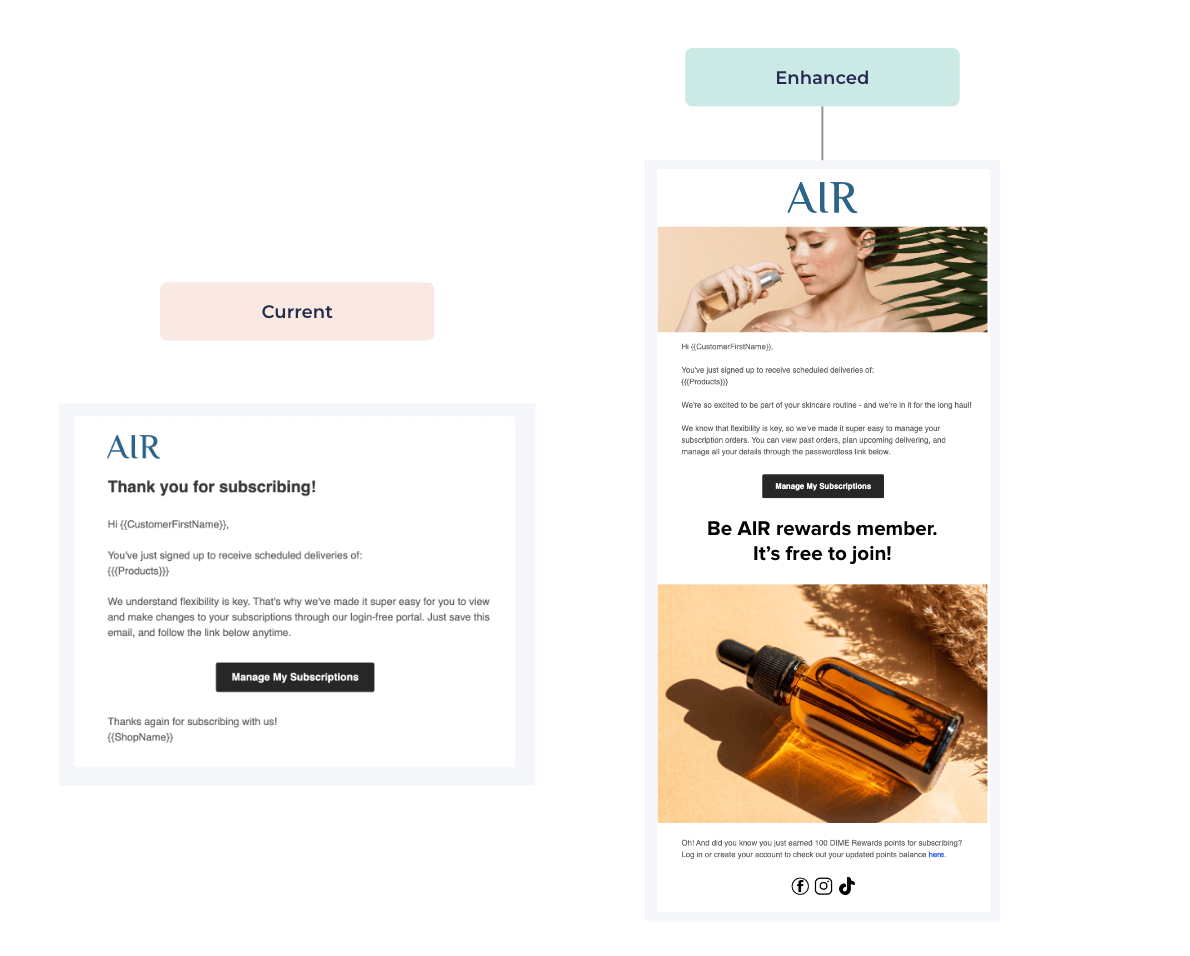
Brand voice
Leveling up transactional emails with your brand’s voice boosts retention, shopper trust, customer lifetime value, and loyalty. Infusing your brand’s personality creates a consistent, memorable experience, reinforcing your identity and fostering a stronger emotional connection with customers.
Continued customer education
Treating transactional emails as educational touchpoints is essential, as it ensures that valuable information about subscriptions is readily accessible and transparent to customers. Avoiding gatekeeping of such information fosters trust, empowers customers with knowledge, and promotes a positive user experience throughout their subscription journey.
If you’re looking for more ways to optimize your subscription business, think about speaking to one of our subscription experts.







 Join a free demo, personalized to fit your needs