As a creative at a fast-growing SaaS company, the people around you are more than likely hyper-focused on lead generation and ensuring ROI for investors. Proving the value in brand projects that have no immediate success metric is a constant challenge. But that doesn’t mean they’re not worth fighting for.
Yotpo’s blog has always been a passion project. From its first iteration to its latest redesign, it’s taken time to establish a following and to get others at the company to recognize its value.
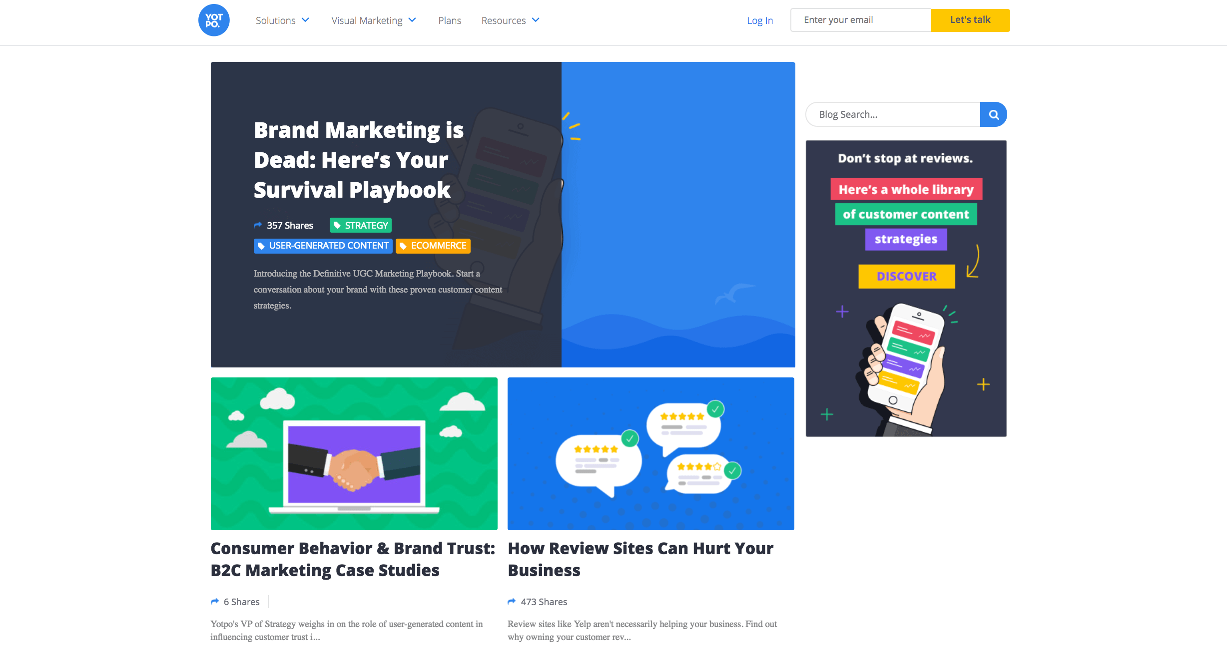
We first began seriously investing in our blog in 2015. Initially, it was designed to be the main engine for our inbound marketing strategy. We tested various tactics to increase traffic, like guest posting and SEO-first posts. And then, based on the lessons we learned in our first year of blogging, we prepared for our first redesign. We optimized the sidebar for lead capture, created higher-converting in-post CTAs, and made social shares highly visible.
It looked like this:
After spending a couple of years pushing forward optimization attempts, SEO-based content plans, and efforts to systematically attract traffic that would convert, we learned that it wasn’t going to work.
While traffic had increased from a handful of people to nearly 40,000 visits per month, the rest of the funnel didn’t follow suit. The path from content to conversion proved to be a winding one rather than a straight funnel. Content is the ideal way to bring people back to your site, educate, and create brand evangelists, but it’s not a direct shortcut to sales.
Once we understood the blog would not be an effective lead magnet, we changed course to focus it around brand.
This meant:
- Overhauling our strategy on social to expand brand reach and spark repeat engagement instead of attracting one-time Google searchers. As a result, social and direct traffic are quickly catching up to search.
- Analyzing top posts by engagement and re-focusing our editorial calendar to highlight what our readers value most (for example, interviews with the experts behind the brands we work with).
- Consolidating other major content projects, like our UGC strategies library and data points, with the blog to create a unified hub for all of our most engaging assets.
All of these efforts led up to a major, final step: A complete blog redesign and content revamp.
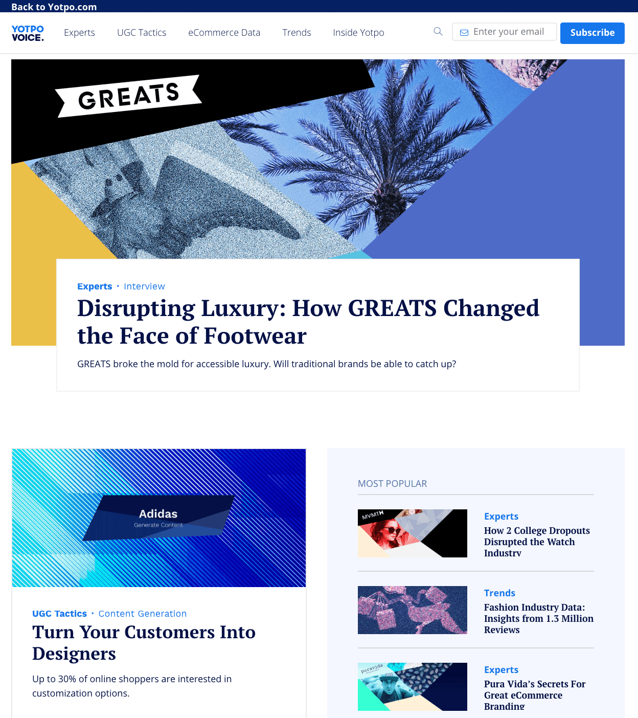
We pulled that off in March (thanks to a crew of talented designers and our first-class developer, David!), and this is what our blog looks like now:
While it might seem like the world (or the rest of your marketing department) is against you, in reality, they’re just trying to balance the zillion other projects that come with driving a fast-paced startup forward.
Once you know what you need — for us, this meant a complete redesign to make our blog stand out, consolidating other major content projects with the blog, and highlighting the experts behind the brands we work with — you have to create a process that gets people invested.
Setting specific goals
Before approaching other teams, it’s important to have a clear idea of what redesigning your blog will look like and what it will achieve.
The former requires a ton of research. Make a spreadsheet and visit every blog you can think of and then some. We did exactly that. For each blog we loved, we pinpointed the elements that made it great — appealing header images, well-positioned share buttons, a sleek scrolling progress bar, a great menu, even tag names. These are the details that help you form a vision for your new blog.
For our content team, it was also critical that the new blog be:
- Enjoyable to read on all devices
- Shareable
- Built for discovery
- Visually engaging
Our design studio had their own set of goals. Yotpo’s Art Director, Shiri, put it like this:
Takeaways: When talking about redesigning, it’s easy to stop at “it needs to look better” or “more modern.” That’s a good start, but you need to dig deeper before presenting the project to stakeholders.
Make sure to:
- Create a research document full of specific inspiration
- Focus on goals that are achievable
- Address both appearance and usability
- Coordinate between the content and design visions
Getting buy-in for your vision: Negotiation & mediation
To justify the resources required for a total blog overhaul, you need to be able to appeal to a broad range of goals. Since the content team and design studio were aligned — the obvious challenge was our growth team.
As I touched on above, when it comes to MQLs, the blog is just not an instant money-maker. That said, marketers need leads. When we approached our growth team with the idea of the blog redesign, lead capture was one of the first topics to come up.
Luckily, we were prepared. The content team’s very own Marketing Project Manager, Ruthie, took in our goals and inspiration and created the most important negotiation tool this project would ever see: a document including specs for a “minimum viable blog” (let’s call that the MVB) as well as “nice-to-haves.” Then our Growth Manager, Amit, did the same.
What this did was give space to the growth team to have meaningful input on the process. We’ve found it to be true across all different projects that when people are involved from the ground up, rather than brought in for final touches, they’re more invested. We could’ve tried to move forward and then came to them to optimize our designs, but the results would’ve been lackluster.
One of the best examples of this strategy in action has to do with with our blog menu.
For the creatives (especially the designers), the idea of a double menu — one for the homepage and one just for the blog — was a serious faux pas. Stacked menus look bad, and if the goal was to have readers explore the blog, why put in an additional menu that would take them away from it?
For Amit and his team, navigation to our main site was non-negotiable. They argued that while reading articles is fine, the ultimate goal is for readers to learn more about Yotpo’s products and to request a demo.
Their MVB included homepage navigation. Ours didn’t strictly rule it out. So the creatives compromised with a slim bar above the blog menu that could send readers to www.yotpo.com without distracting from the main menu.

Speaking about finding the ideal compromise, Shiri said:
Takeaways:
- Incorporate other team’s needs from the get-go
- Don’t start working without two minimum viable product documents: one that answers to branding needs and one that answers to product needs.
- Stick to your must-haves, but be flexible about everything else
Creating a work plan
There are endless moving parts in a blog redesign project. No matter how organized you are, you will forget or underestimate something. So, start by taking a deep breath.
For our redesign, Ruthie created a super detailed project plan so she could have eyes on on everyone’s tasks up to launch day. The three major workflows to watch were content, design, and development. Despite the fact that dev comes at the end of a project, she kept in constant contact with our developer. At the end of the day, he had the final say on what could be created and how long it would take.
Each stage, from inspiration and ideation to wireframes and QA were accounted for in the project plan, alongside an owner and a due date. Ruthie broke each major task down as much as possible so she could track progress accurately and update any deadlines as needed.
On the content front, the redesign afforded our team the opportunity to really clean out the blog — remove any old, unwanted posts, adjust headlines to fit the new design plans, and select menu categories that would reflect our editorial direction. Since our design studio depended on our list of blog posts that would go live and our choices for menu labels, it was crucial for content management to be handled on schedule and in tandem with design.
According to Ruthie:
Takeaways:
- Create a comprehensive, centralized project plan, rather than a separate one for each team involved
- Break each task down to its smallest parts and give every mini-task a dedicated owner and due date
- Keep an eye out for dependencies. If designers can’t move forward without content, stay on top of the content task to avoid a drop in momentum.
What we learned
Even with a detailed project plan in place, things can and will go wrong — or at the very least, they’ll go long. Without a doubt, the issue we ran into most was time.
Design took longer than expected, as did development, and even all the backend upkeep (swapping out photos, changing headlines, etc.). So, be sure to plan any project of this scale with serious buffers.
Another thing we learned thanks to our design studio is how make even the most creative processes efficient. Our designers had to create more than 200 new images — one for each article under the five categories on the new blog.
Instead of beginning to design them one by one, Shiri created a scalable system for image production. First, the content team mapped each article by category and priority. Then, the designers evaluated which posts would get a brand new image and which would just get a facelift.
The next step was to create a visual theme for each as well as a sort of stylistic template per category to streamline the process of creating so many images. The templates also made it easier to design blog images going forward, since the category now automatically provides the designer with a basis from which to work.
And finally, I mentioned this up top, but there is seriously no way to overstate it: Don’t sweat the small stuff. Fight only the battles that are non-negotiable and be open to compromise on everything else — you never know what kind of new, creative ideas collaboration can lead to.


