Shopify is home to over 500,000 active stores, and standing out among so many eCommerce businesses is not an easy task for a growing brand. In today’s crowded market, catching the eye of customers — not to mention retaining them — is harder than ever.
It’s hard, but not impossible, and there’s a lot that a new Shopify store owner can learn from brands that are succeeding. If you’re looking for inspiration to improve your eCommerce site, then check out our picks below for successful Shopify stores that have a “little something special” to capture shoppers.
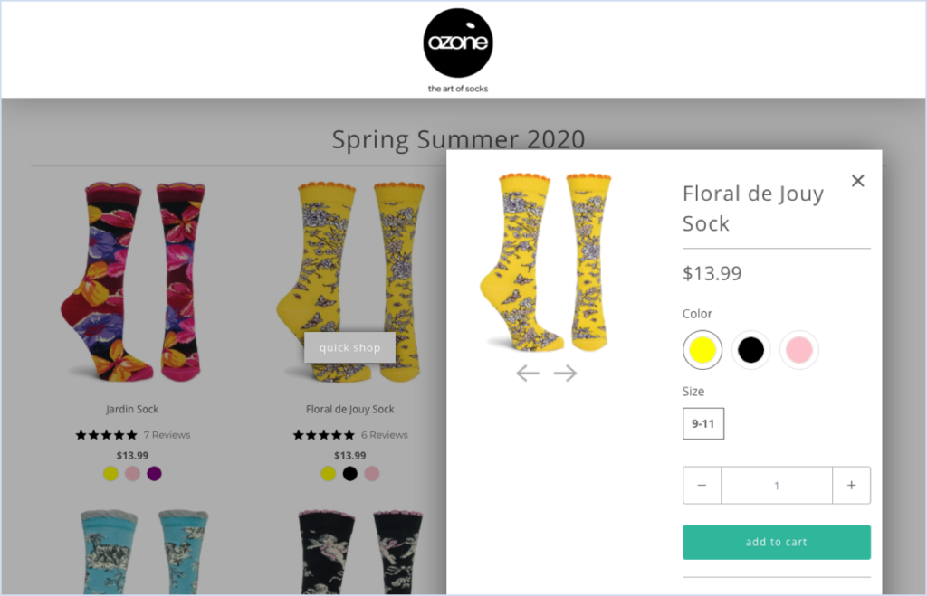
Ozone Socks
Category: Clothing
Founded in 2000 by Parisian designer Laurie Mallet, Ozone Designs set out to put fun and fashion into their socks and tights. Ozone’s museum-worthy socks are sold all over the world and have been featured in many publications, including Vogue.
In addition to being fashionable and fun, the Ozone Socks website is designed with instant purchases in mind. Featuring both classic and recent collections alongside star ratings and product reviews, the homepage allows shoppers to easily buy socks without clicking through to a product page.
Why It Works:
- Quick purchase decisions: Offering your shoppers the option of buying your best sellers or your newest releases right from your homepage makes it easier for customers to act on impulse.
- Building brand trust: Showcasing product photos, star ratings, and customer reviews all in one glance builds immediate trust with your potential buyers. Seeing other customers review your product makes it easier for buyers to find the right product, increasing customer satisfaction and potentially even reducing return rates.
Shopify store with Yotpo
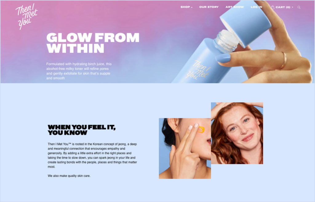
Then I Met You
Category: Beauty
After spending five years in Korea, Then I Met You founder Charlotte Cho wanted to create a beauty brand that conveyed a feeling of “jeong,” or a deep and emotional connection. The brand’s formulas are clean and free of harmful substances like alcohol or silicon, and the packaging is 100% recyclable and printed with soy ink.
Then I Met You is not only mindful about the environment, but also about its branding and website. As you scroll down the homepage, the experience shifts colors to match the product branding. The images are consistent with the site’s design language, and even the fonts used on the website are identical to the fonts for the actual products.
Why It Works:
- Immersive experience: Shoppers are immediately transported into the world of Then I Met You. When matching your site with your product and branding, you naturally invite potential customers into your world in a seamless way.
- Memorable: Good branding creates recognition. When your branding is seamless, consistent, and eye-catching, it’s easy for customers to recall and even refer others to your store.
Big Blanket Co
Category: Home Decor
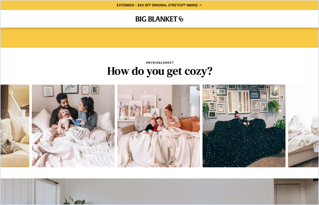
Big Blanket Co delivers exactly on its promise: the biggest blanket you can find. The bog blankets come in an assortment of colors and textures, and Big Blanket Co has a cheerful website packed with photos of happy people snuggling up with the signature products.
But professional, “staged” photos are just one piece of the puzzle, and Big Blanket Co has an entire section dedicated to Instagram posts from real customers enjoying their Big Blanket. What’s more, consumers can even shop the blankets directly from the posts!
Why It Works:
- Social proof: These days, saying people enjoy your product is not enough. By showing real buyers enjoying its products, Big Blanket Co is providing social proof that its products are as good as it says they are.
- Transparency: Going hand in hand with providing social proof, it’s important for a brand to be transparent to its customers. Showcasing Instagram posts from real accounts adds a layer of trust to the shopping experience.
CoEdition
Category: Clothing
With a mission to bring a world of fashion to more women than ever, New York City based CoEdition is the first contemporary marketplace designed to cater to women sizes 10 and up. Home to a plethora of top designers and a vast product catalogue, CoEdition combines a fun shopping experience with useful style guides and tips.
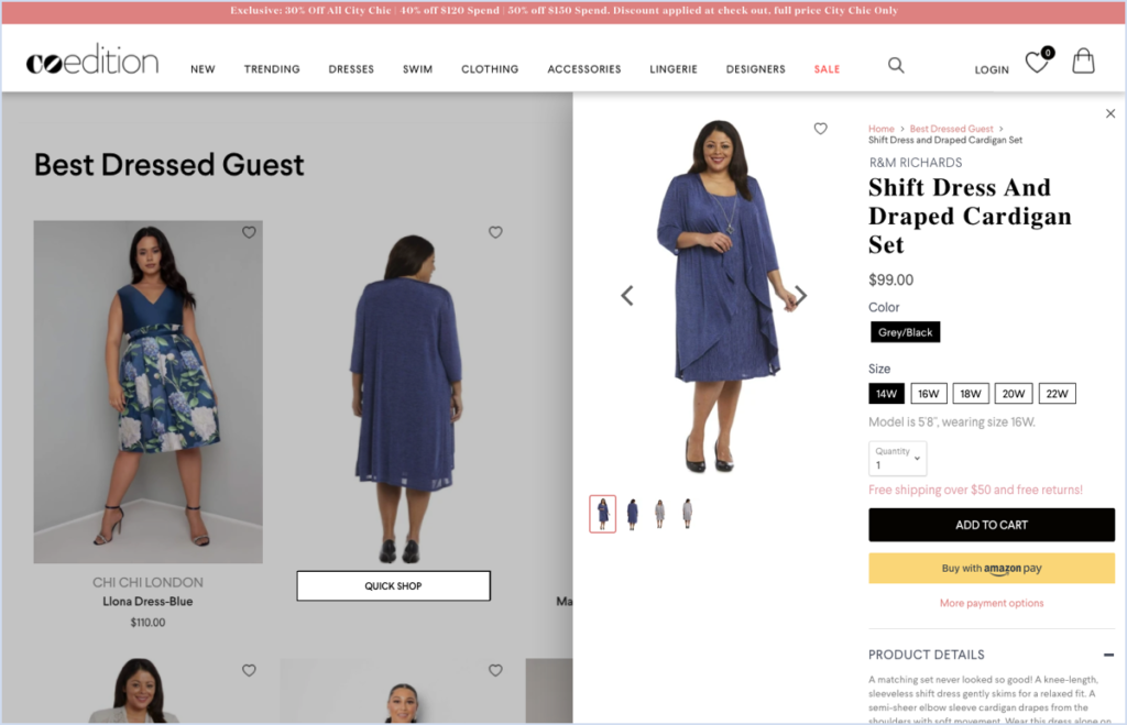
To make the shopping experience quick and easy, CoEdition enables its customers to “quick shop” right from the product gallery pages without having to click away. The experience opens a pop up with all the information a customer needs to consider the item and check out.
Why it works:
- Short path to purchase: By letting customers shop right from the product gallery page, CoEdition is shortening the purchase journey. It’s also convenient for browsing customers; if they add an item to their cart, they won’t lose their place in the gallery and will still be exposed to all the products.
Wilding
Category: Skin Care
Founded by three inspiring women, the Wilding skin care brand is all about sustainability and self-love. Focusing on the ancient Chinese technique of Gua Sha, which means moving chi or energy through one’s body, Wilding manages to blend the modern and the old together into a beautiful, eco-friendly package.
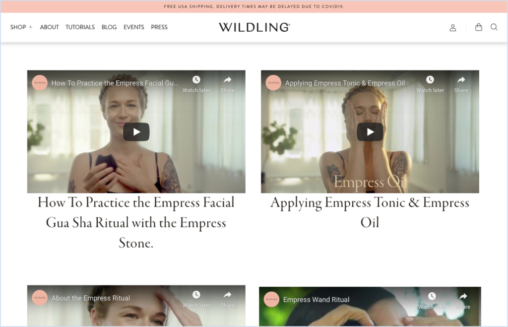
But not everyone is familiar with Gua Sha or chi, and the Wildling founders provide a dedicated tutorials page, as well as “how to use guides” on every product page. The guides are incredibly detailed, explaining how the products are made, how to use them, and what effect one can expect from using Wilding products.
Why It Works:
- Transparency: Customers will feel more comfortable buying products if they understand the ingredients and processes behind them. This is especially true when it comes to skin care, since many shoppers may have healthy skepticism about new products online. Giving them an honest and clear view of Wilding’s products is key.
- Brand trust: Showing potential customers how to use Wilding products can instill trust in the brand. Customers get to see how the product is packaged, how it looks in real life, and most importantly how they can make the most out of it.
Lowland Kids
Category: Clothing
Lowland Kids started as a small DIY business from a mom making clothes for her kids. But as the business evolved, it quickly became clear that kids clothing patterns on the market were substandard, and Lowland Kids began making its own unique patterns as well.
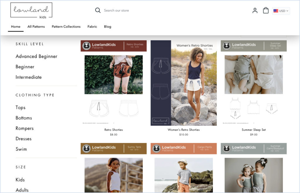
A DIY clothing store dream, the Lowland Kids website offers shoppers the option to shop for their own patterns and fabrics to match. Lowland Kids offers smart product filters that allow shoppers to find patterns not only by pattern type, but also by sewing skill level and size.
Why It Works:
- Simplicity: People can get overwhelmed by too many choices, and offering granular search options can make it easier for shoppers to navigate to the right products. If shoppers feel comfortable on a website, they might feel more inclined to make a purchase.
- Customer lifetime value: Shoppers can scale up in product difficulty as their skills grow, which makes Lowland Kids an appealing option when customers are ready to try something harder. This dynamic also encourages shoppers to equate that sense of accomplishment with the brand itself.
Beard Octane
Category: Grooming
Handmade in the US, Beard Octane is proud to highlight its connection to real blue-collar workers and first responders through the years. The brand promises high-quality products and a personal connection to shoppers, should they run into issues.
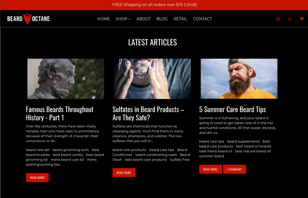
Aside from giving customers access to product reviews and ratings right on the homepage, there’s also a section full of educational articles about grooming that don’t focus on the brand and its products. Beard Octane is giving its customers more than just a shopping experience; it’s opening a window to all things beard.
Why It Works:
- Brand awareness: Encouraging customers to learn from the site can make them feel like Beard Octane brand is offering them something that is more meaningful than a product.
- Returning customers: Publishing content that has broader appeal than the product line turns Beard Octane’s website into more than just a store, and people might return to it to learn more.
Restore
Category: Skin Care
As a dermatologist, Dr. Heather D. Rogers was unhappy with the products that were available to her patients, so she decided to create her own. The Restore skin care line has a range of everyday essentials that come in sustainable packages.
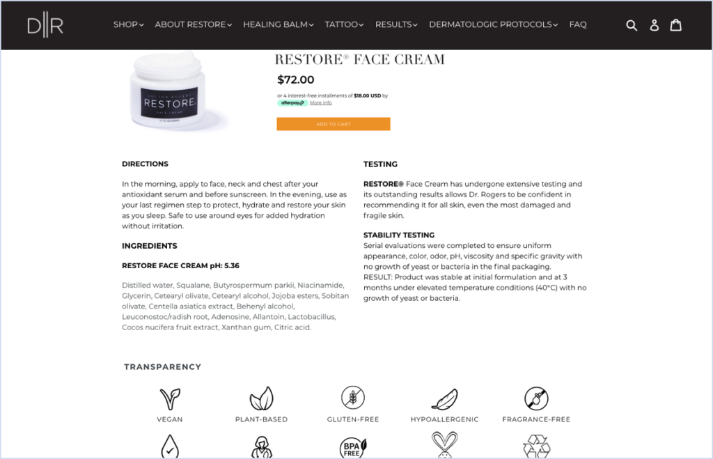
But buying skin care online can be scary when people aren’t sure what they’re actually buying. The Restore shop addresses this issue by simply laying it all out in the open. Each product page not only features information about the ingredients, but Restore also includes details about the testing stages the product went through. Customers can also watch a video of Dr. Rogers talking about the products.
Why It Works:
- Transparency: It is very important that customers know what they are buying. Detailing the ingredients or materials used to create the product helps Restore’s customers make an informed decision and feel satisfied that they won’t regret the purchase later.
- Creating trust: By being transparent about its products, Restore is instilling trust in its brand. People respect honesty and are more likely to buy from a brand that has nothing to hide.
Leotard Boutique
Category: Children’s Clothing
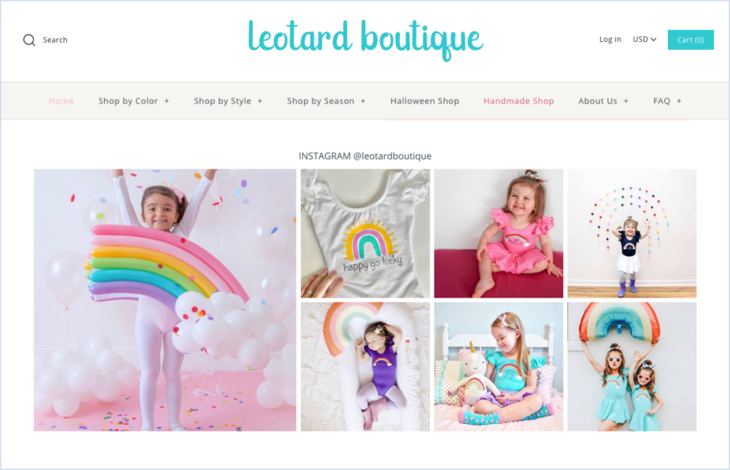
This boutique specializes in leotards, skirts, and tights for kids, with a seemingly endless selection of cuts, fabrics, and styles. The Leotard Boutique makes it easy for customers to navigate with filters that can be directly accessed in the navigation bar on the homepage. Customers can look for clothes based on style, color, and even season.
Why It Works:
- Customer-focused: Easy and intuitive navigation is incredibly important. The easier it is for customers to find what they’re looking for, the more likely it is that they’ll follow through with a purchase. If the search is too convoluted, customers might bail.
Elixinol
Category: Supplements
Elixinol offers a range of hemp-based products, and with over 25 years of experience, the brand is committed to educating shoppers about the benefits of the hemp plant. Elixinol’s products don’t have any chemicals or synthetics, and the website is full of useful and educational information to help shoppers find the right product for their needs.
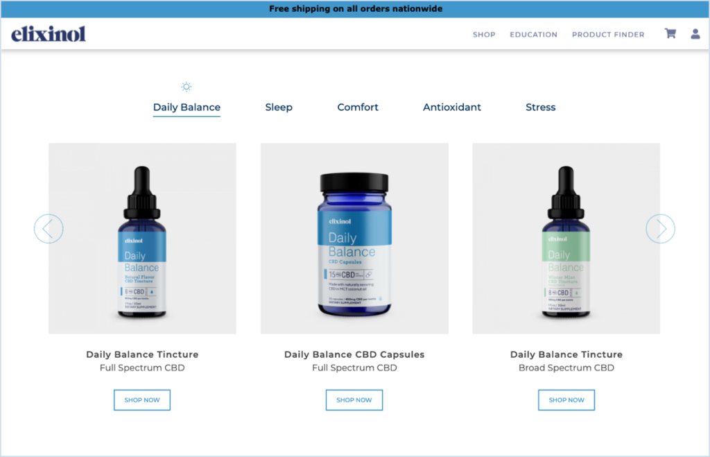
With the understanding that not everyone has the time (or will) to go through heaps of information, Elixinol is giving its customers the ability to filter products based on their individual needs. No hassle and no overload of information; just a straight path to purchase that has the shoppers’ best interests in mind.
Why It Works:
- Fast and easy shopping experience: By allowing shoppers to filter products based on their needs directly on the home page, Elixinol is shortening the path to purchase.
- More than a brand: By providing information about not only the product but also the background on its ingredients or the brand philosophy, Elixinol is creating a level of credibility with its customers. Creating resources that go beyond the products can make customers feel more confident when shopping.
Wild Zora
Category: Food & Beverage
This family-owned company set out to change the way we think about our food and how we eat it. Using only the best ingredients, Wild Zora offers affordable, healthy, nutritious, and (most importantly) tasty snacks and meals to families all over the United States.
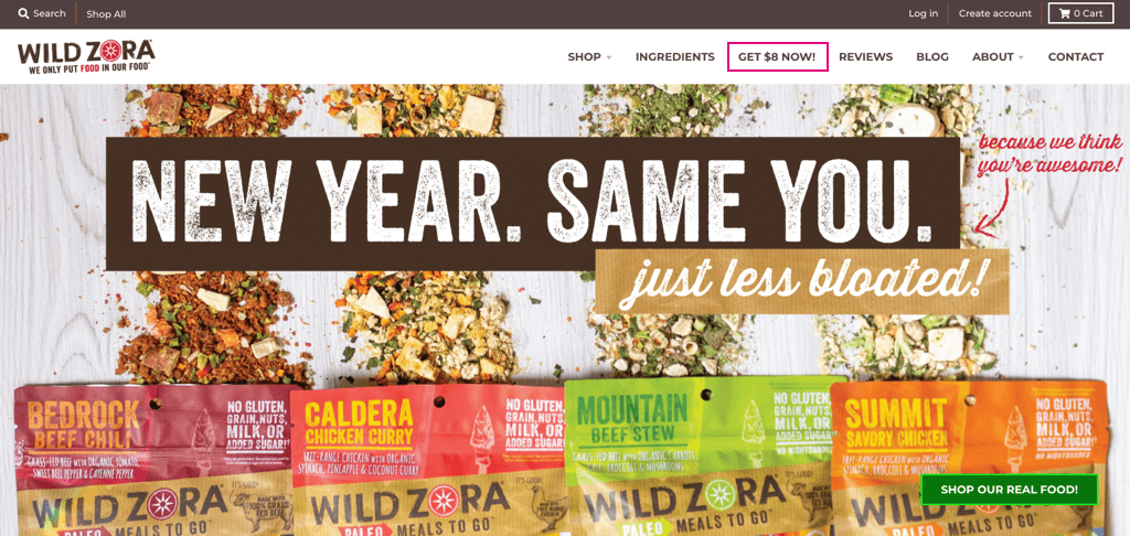
But at Wild Zora they understand that people aren’t just looking for a good meal—they also love a bargain! Right in the navigation bar customers can see a tab offering $8 on the spot. The $8 offer is a nice perk that doesn’t require a purchase; shoppers only need to sign up for the company’s free newsletter.
Why It Works:
- Eye-catching: People like getting free gifts. Having a promo available right in the navigation bar ensures that customers won’t miss it, and it dramatically increases the chances of customers both subscribing to your services and completing a purchase.
- Customer-centric: Offering a free perk without purchase conveys to shoppers that you’re hoping to build a relationship rather than just push the fastest sale. Customer-centric marketing initiatives build trust, and in turn, shoppers are more likely to come back to your store.
SP Athletic
Category: Wellness
SP Athletic was founded with the goal to help people attain the best and the healthiest versions of themselves. This life wellness company offers customers much more than just athletic apparel and accessories; they offer everything one needs to embrace a healthier lifestyle.
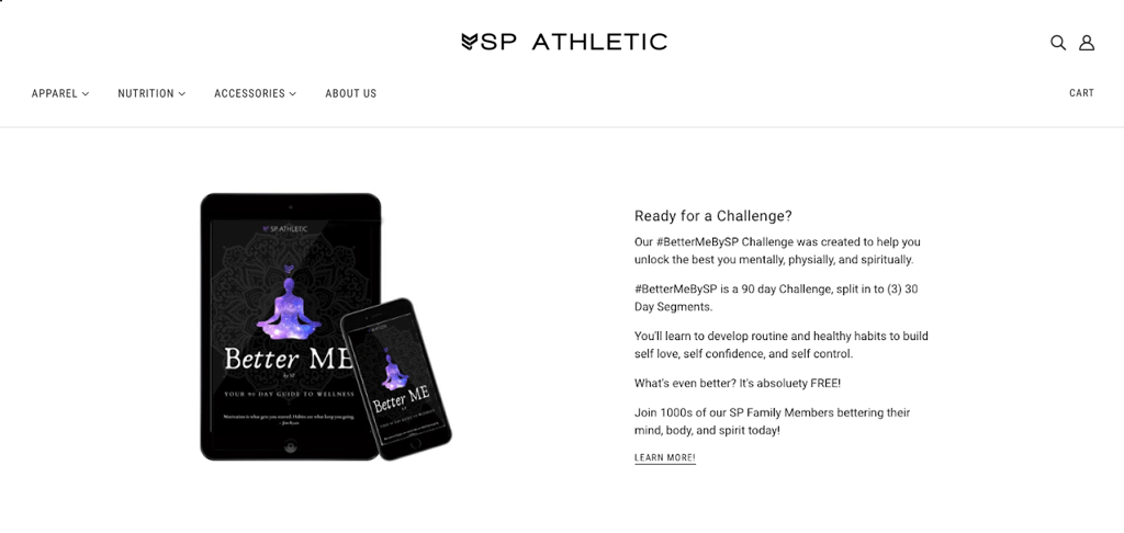
Between the comfy gym attire and the protein powders, SP Athletic upped their game with their #BetterMeBySP Challenge. The program is a free 90-day challenge dedicated to helping people develop a healthy lifestyle based on self-love.
Why It Works:
- Thinking outside the box: Changing lifestyles is a difficult and oftentimes expensive process. Offering something more than just your product line is a great way to support your customers as they try to embrace change.
- Strengthening the brand-customer relationship: By giving customers something they can take into their everyday lives you can actually deepen and strengthen the bond between them and your brand. Customers that feel a real connection to a brand are much more likely to return, and often they’ll bring new customers as well.
Varley
Category: Women’s Apparel
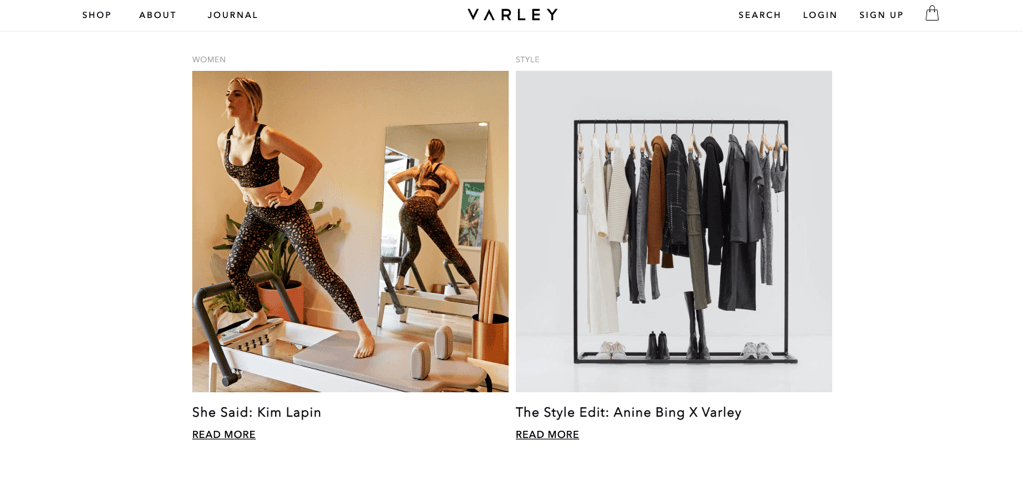
Varley is a family-owned business hailing from London and L.A. The brand draws its inspirations from both cities to create the perfect performance fashion dedicated to the busy life of the modern-day woman. With an endless pursuit of the best quality and fit, they offer something for every type of woman.
Varley does more than simply claim to have the modern woman and her life at the forefront of their vision; they also offer them a voice. In their journal “Well Said”, Varley collects stories from a diverse and strong group of women. In each entry, they answer questions about their personal lives, their profession, and their experiences as women in today’s face-paced world.
Why It Works:
- Customer-based content: Varley is a brand that is dedicated to women and they are focusing their content on their distinct client base. When creating content that is based on your targeted demographic, you are giving customers a sense of belonging. It’s important that the content you create is appealing and interesting for your customers to engage with.
- Diversity: There is no such thing as a cookie-cutter customer. Every customer is a different person with different experiences. It’s important that as a brand you shine a light on as many people from your demographic as you can. The more diverse your content is, the more people can relate.
Vegamour
Category: Beauty
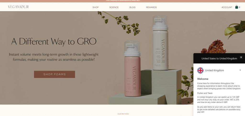
Vegamour is a cruelty-free and vegan hair and beauty brand, with products for hair, brows, lashes, and more. Vegamour products are based on ethically sourced, sustainable ingredients.
Today, worldwide shipping is more than a perk — customers expect it, and Vegamour knows it. They also know that shipping isn’t a one-size-fits-all matter, so they provide customers with all the information they need upfront. On the homepage, customers can pick their shipping destination and immediately get all the shipping information they need for that specific destination, including tax and VAT prices.
Why It Works:
- Shipping matters: Shipping is one of the most important factors when deciding to purchase from an eCommerce business, especially when catering to audiences in multiple countries.
- Transparency: There are few things more annoying than going through checkout only to realize that you need to pay extra for shipping. By being transparent about all charges, whether they exist or not, customers are more likely to follow through with their purchase.
Sönd
Category: Skincare
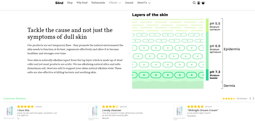
The team behind Sönd understands the struggles of living with non-conforming skin and the direct effect it can have on our everyday lives. The London-based skincare brand is dedicated to helping customers understand and love their skin while working to improve it.
As part of their educational process, Sönd have created #Skininfo. In this tab, conveniently accessible through the navigation bar, customers can read all about the condition of their skin (let’s say dry skin) and get recommendations tailored to their individual needs.
Why It Works:
- Builds confidence: Demonstrating a deep knowledge of the problems your product is trying to solve will make customers feel more confident choosing your brand over others.
- Boosts SEO: When shoppers search for products online, they will often use relatively general terms, related to their specific needs. But the competition online is high and standing out on search engines is hard. By creating pages dedicated to, for example, dry skin, your brand is creating a pool of relevant keywords, that in turn will help you stand out in high-intent searches.
WILLY California
Category: Apparel
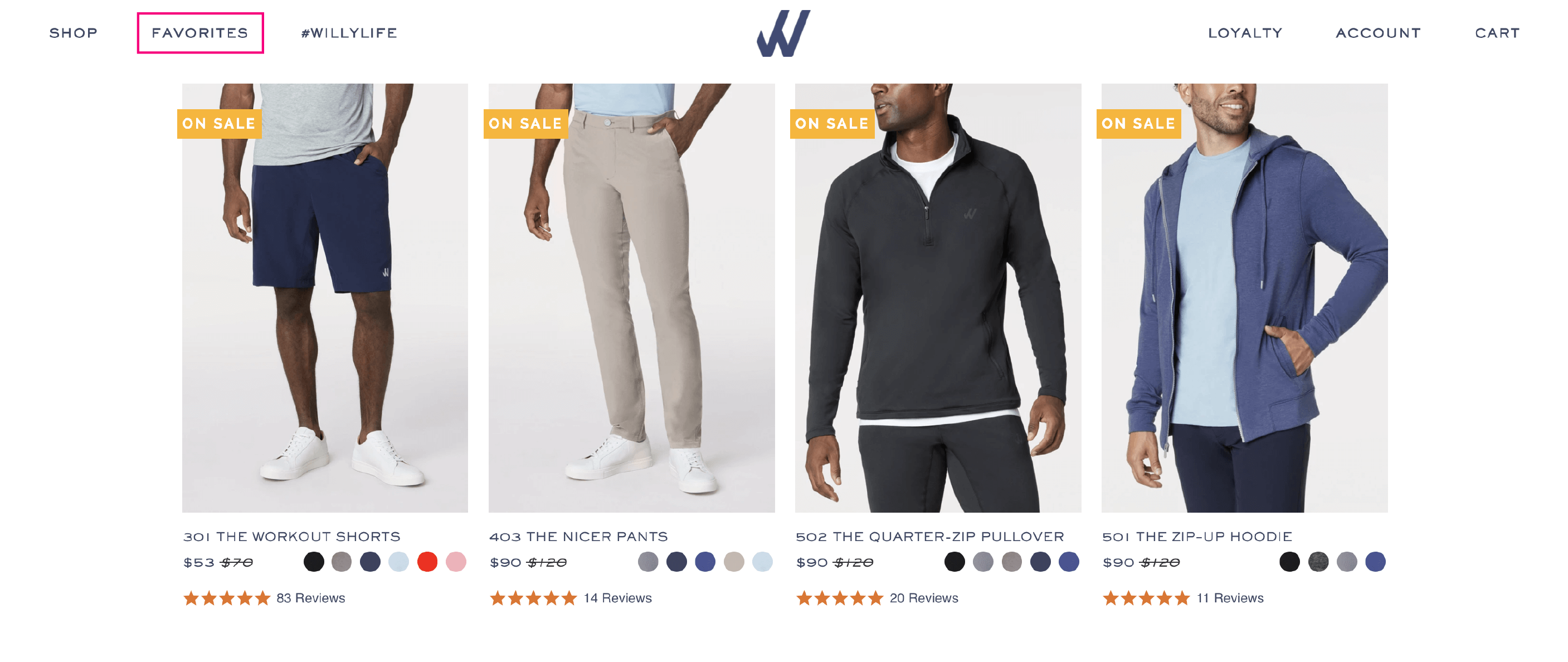
This California-based clothing company was created when one of the founders moved to L.A and realized that his new lifestyle didn’t match his old wardrobe. With both founders also acting as soccer coaches for their kids, they needed clothes that worked both on and off the field. And so, WILLY was born.
WILLY is the perfect combination of office and active wardrobe. Their core collection took three years to develop, with extensive research to ensure it truly fit the L.A lifestyle. To help shoppers enjoy the best WILLY has to offer, the company created a “Favorites” category that’s easily accessible from the navigation bar, with a selection of their top-selling items.
Why It Works:
- Helping newcomers: New shoppers can be a bit hesitant to try new products, or overwhelmed by everything your brand has to offer. By offering them a selection of bestsellers, you can help give customers a feel for what your brand is all about.
- Decision making: By showcasing a selected few items as the brand’s favorites, you can help customers (old and new) make a smart and easy purchase decision.
Astura
Category: Beauty
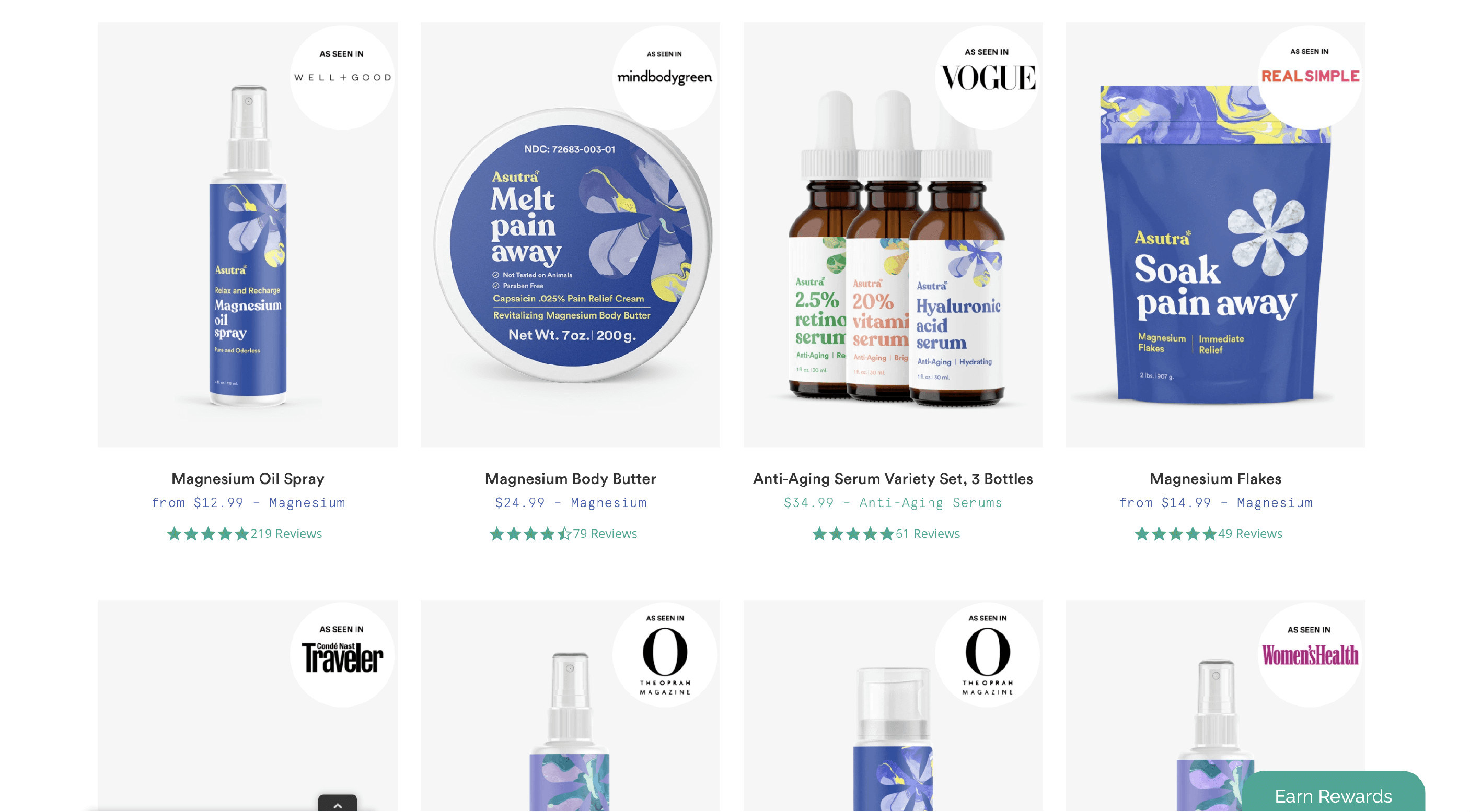
Astura is a woman-owned beauty brand, led by Stephanie Morimoto, with a strong message: self-care isn’t selfish. Morimoto’s team created natural, safe products for women at an accessible price.
By promoting that active self-care is equally important to your physical and mental well-being, Astura has managed to create a safe, open, and empowering environment for women. Although they have over 15K reviews, Astura knows that sometimes testimonials or reviews from well-known brands can also assist in the decision-making process, which is why they have a section dedicated to products reviewed by popular publications — right on the home page.
Why It Works:
- More than social proof: While we know that customer reviews are the #1 factor for customers when they’re shopping, highlighting products reviewed by recognizable publications adds another level of social proof and credibility
Goddess Detox
Category: Beauty
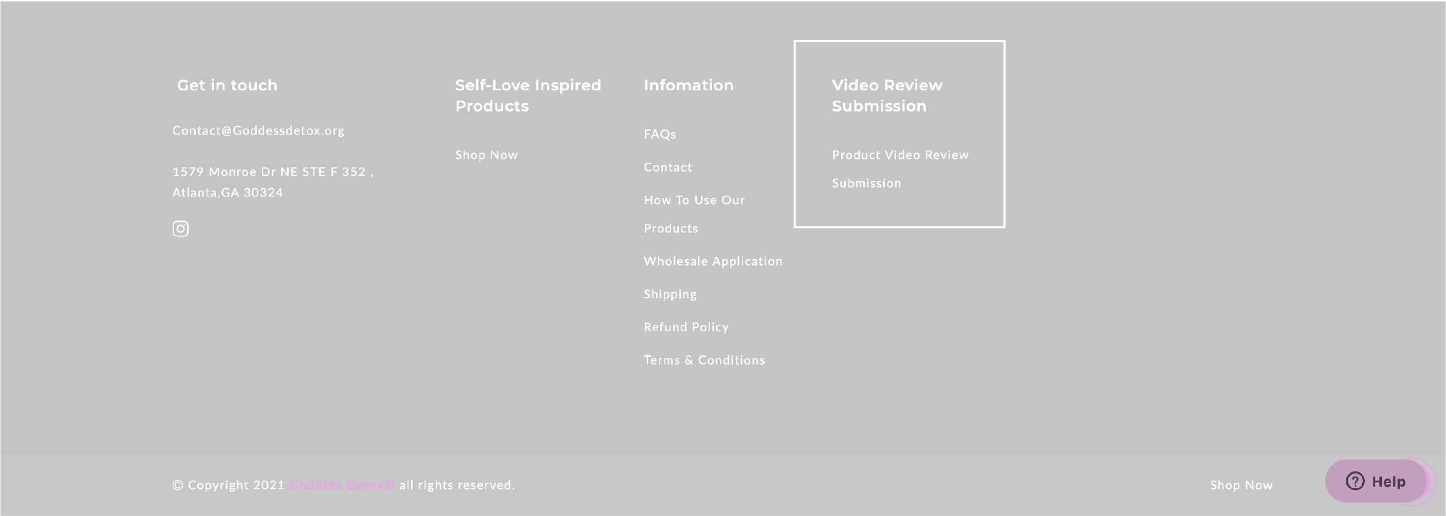
Goddess Detox is on a very important mission — to help women connect with themselves, be in tune with their bodies, and understand their true power. This woman-led brand is using herbs to aid women with their physical, spiritual, and emotional detoxing.
To help women get a better understanding of what Goddess Detox has to offer, and to help them content to the products, they are promoting another layer of social proof – video reviews. Now, customers can do more than write about their experiences, and share a photo of the nice packaging. They can sit down, and tell their whole story, in their voice, and share what this detox has done for them.
Why It Works:
- Creating a personal connection: By encouraging customers to share video reviews, Goddess Detox is creating a deeper, even more personal connection between brand and customer. But more importantly, between the customers themselves.
- Increasing trust: If a picture is worth a thousand words, how much is a whole video worth? Watching video reviews can dramatically increase the trust customers have in a brand. Video reviews aren’t always as curated as a photo, and listening to other people tell their stories can make new customers more inclined to complete a purchase.
Shopify store with Yotpo
As these successful Shopify stores illustrate, there are many factors that will make your store a success. Ultimately though, it all comes down to creating an amazing experience for your customers. Many brands turn to Yotpo to help them create these experiences that result in supercharged sales and marketing.







 Join a free demo, personalized to fit your needs